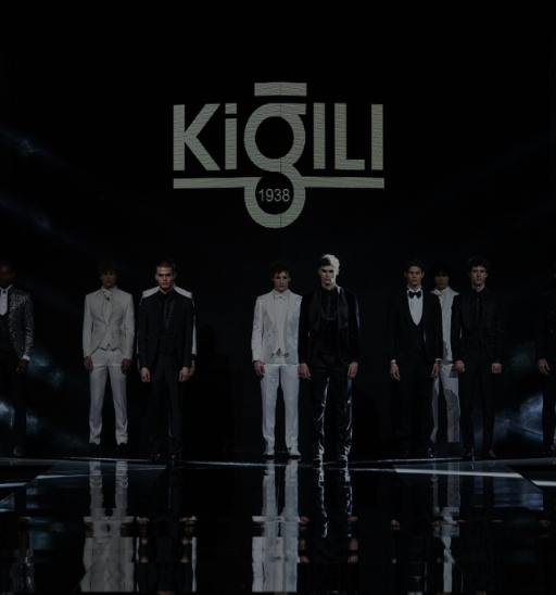
KİĞILI’S RE-BRANDING
-
KİĞILI’S RE-BRANDING
-
3 years
-
BRANDING
İstanbul,Turky
Upgrading the fashion industry with the taste of Kigili. Introducing to the gents and ladies. The logomark got a simple but effective polish, with tighter tracking and smoother lines, accompanied by a new symbol: a three-dot design inspired by an ellipses. The color palette also expanded, giving designers a rainbow to play with. And, as Medium is all about the written word, Collins incorporated actual language into the visual language through images created from letters and words.

